Google Sheets Course: Charts
Insert a Chart
To insert a chart from the following table (lesson-8.xlsx), select the cell range and click on :

The default chart model is then inserted and the chart editor (on the right) is displayed:
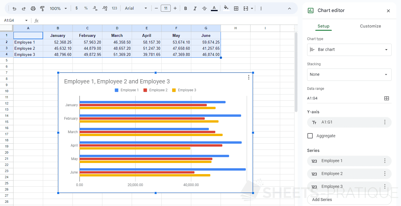
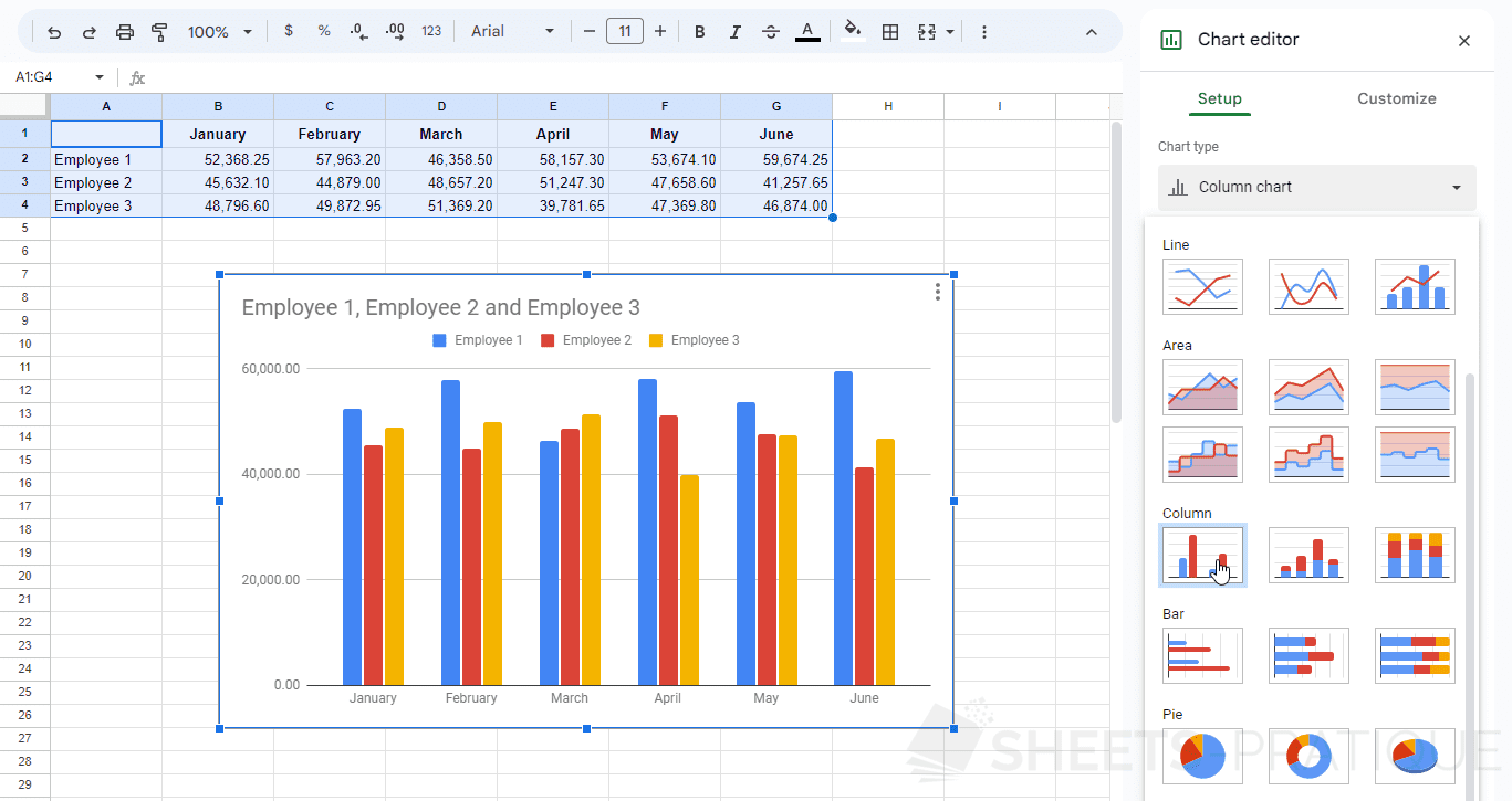
You can then easily change the chart type from the first drop-down list in the editor:
From this tab, you can also change the data ranges and other settings that can vary depending on the type of chart chosen.
Customize the Chart
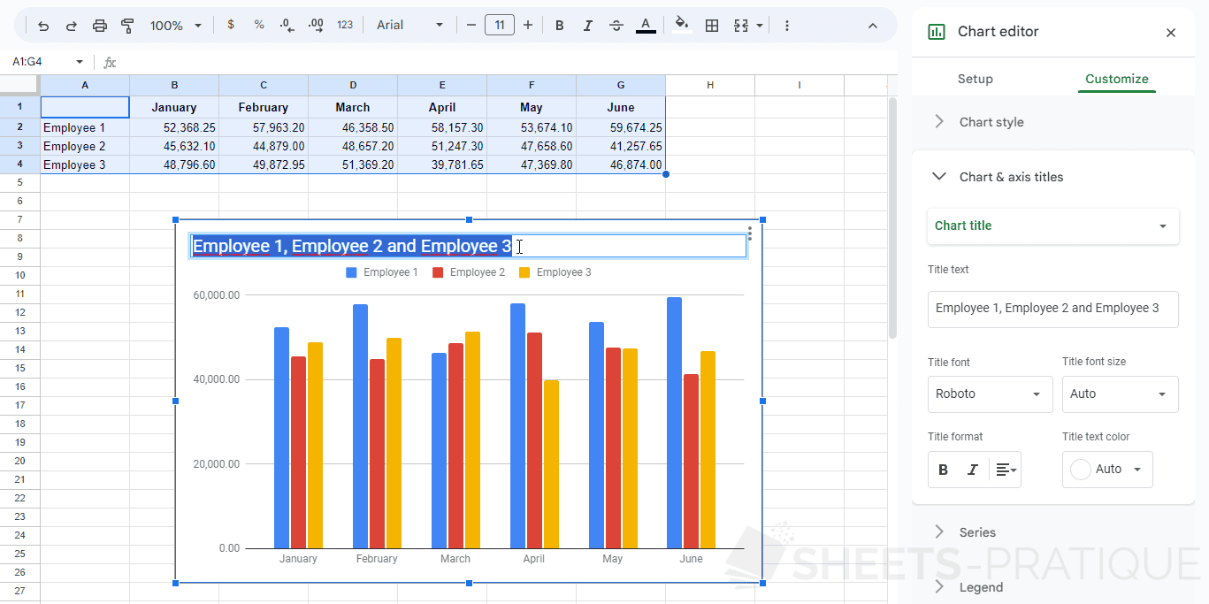
To change the appearance of your chart, click on the second tab "Customize" of the editor:

To modify an element of the chart, you can also double-click directly on this element.
Example with a double-click on the title:
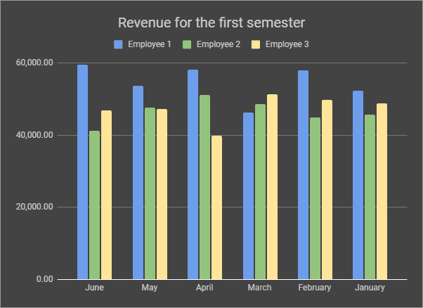
By modifying the settings of the "Customize" tab, you will quickly obtain a customized chart:
Explore Panel
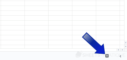
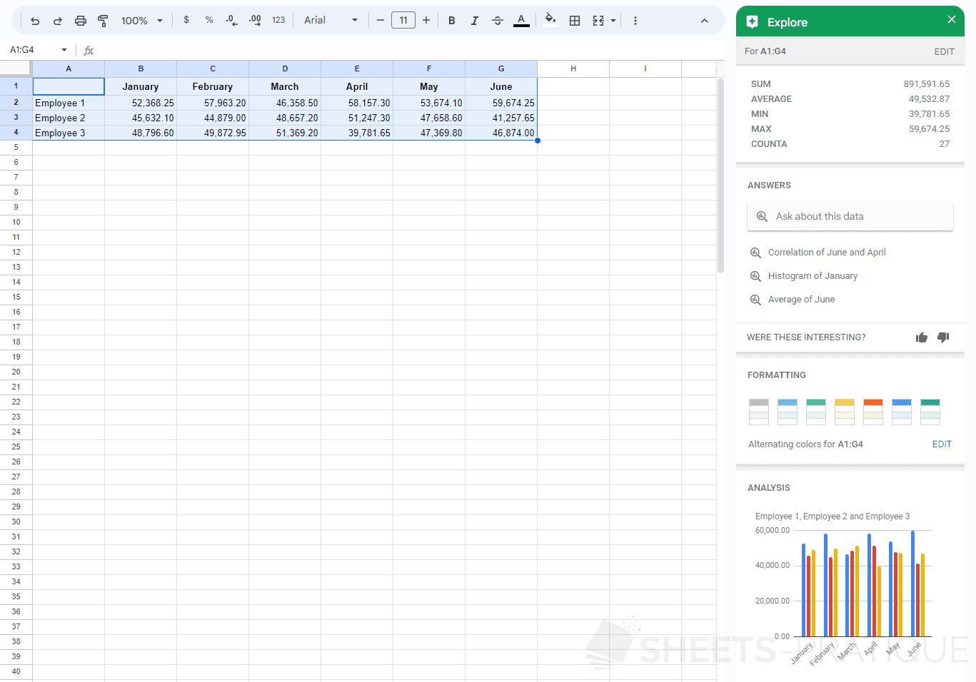
Select the cell range and then open the Explore panel by clicking on the button at the bottom right of the screen:
The artificial intelligence will then seek to determine what could be most useful to you based on the selected data and display it in this panel.
In this case, the AI displays numerical statistics (sum, average, etc.), proposes to format the table with alternating colors and displays different analyses in the form of charts:
You can insert charts directly from the Explore panel if you wish.