Google Sheets Course: Sparkline Charts
A Sparkline chart is a mini chart inserted directly in a cell.
In Google Sheets, the Sparkline chart is available as a function.
Insert a Sparkline chart
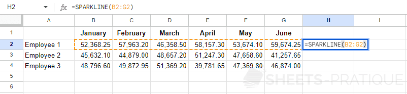
To create a Sparkline chart, insert the SPARKLINE function and select the source data:
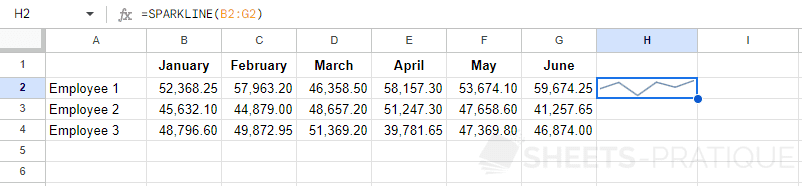
The chart is then inserted in the cell and gives you a visual preview of the different amounts to its left:
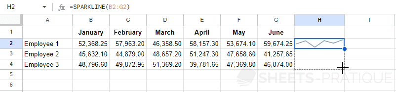
Since it's a function, you can copy it:
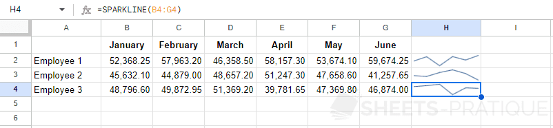
To get:
Customize a Sparkline chart
To get a customized version of the Sparkline chart, you need to enter one or more parameters (separated by ;) between {} as the second argument.
For example:
=SPARKLINE(B2:G2,{"charttype","line"})The types of Sparkline charts
The curve chart (by default):
=SPARKLINE(B2:G2,{"charttype","line"})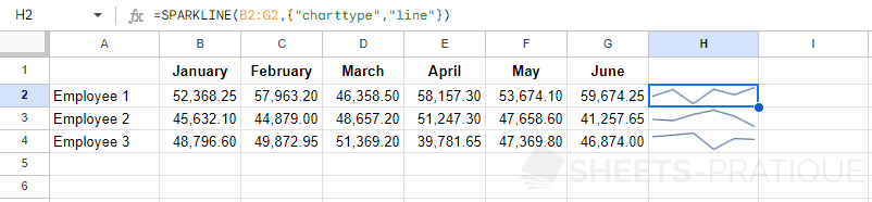
The stacked bar chart:
=SPARKLINE(B2:G2,{"charttype","bar"})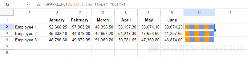
The column chart:
=SPARKLINE(B2:G2,{"charttype","column"})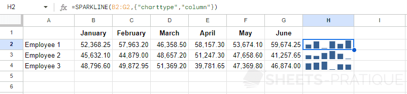
The positive or negative chart:
=SPARKLINE(B2:G2,{"charttype","winloss"})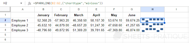
Color of Sparkline Charts
The column chart in green:
=SPARKLINE(B2:G2,{"charttype","column";"color","green"})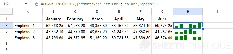
You can enter a color by its name (green) or by its hexadecimal value (#008000).
The curve chart in pink:
=SPARKLINE(B2:G2,{"charttype","line";"color","#ff009a"})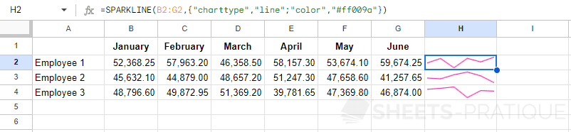
Here it is not necessary to specify the type since it is the default chart type:
=SPARKLINE(B2:G2,{"color","#ff009a"})Color of the Minimum and Maximum
The column chart with the minimum in red and the maximum in green:
=SPARKLINE(B2:G2,{"charttype","column";"lowcolor","red";"highcolor","#00b100"})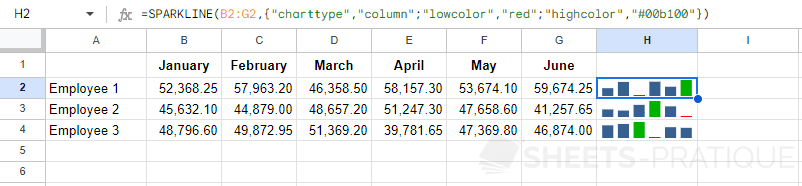
Line Thickness
The curve chart with a thickness of 3:
=SPARKLINE(B2:G2,{"color","#00b1ff";"linewidth",3})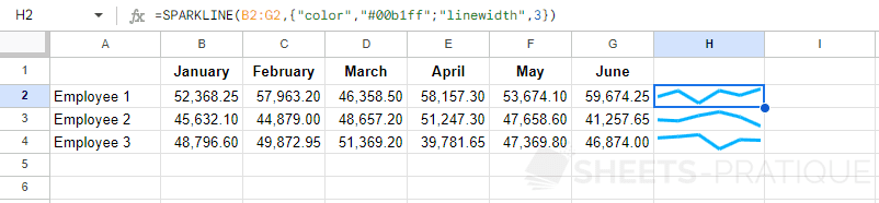
Y Minimum and Maximum
The column chart with a defined Y range:
=SPARKLINE(B2:G2,{"charttype","column";"ymin",20000;"ymax",80000})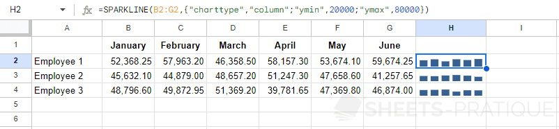
Bar Chart with Maximum
The bar chart with a maximum defined at 400000:
=SPARKLINE(B2:G2,{"charttype","bar";"max",400000})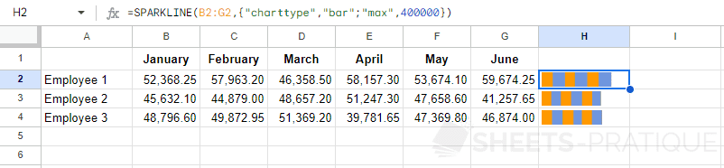
To give the appearance of a sum, use a single color:
=SPARKLINE(B2:G2,{"charttype","bar";"max",400000;"color1","#65cd2c";"color2","#65cd2c"})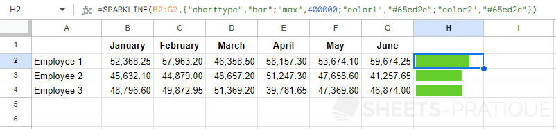
The version with a single value and a maximum defined at 60000:
=SPARKLINE(B2,{"charttype","bar";"max",60000})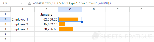
It is also possible to use functions to define the values of SPARKLINE parameters. For example, the maximum here is calculated using a function (then rounded to get a whole number):
=SPARKLINE(B2,{"charttype","bar";"max",ROUND(MAX(B$2:B$4))})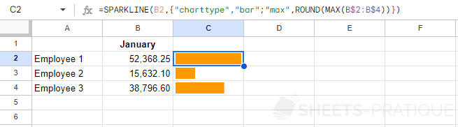
More Colors
A list of 729 colors that can be used with SPARKLINE is available here: list of colors
More Parameters
There are many other parameters to customize your Sparkline charts.
This list is available on Google's website: https://support.google.com/docs/answer/3093289